Question for you: Why are you doing #OneWeek100People?
I’ve spent most of my adult life just getting good at drawing – for no particular reason. Besides the reason, ‘I love drawing’. That’s the best reason to do anything, isn’t it?
I’ve worked as a game designer, and of course taught art – but to be totally honest, these weren’t really *goals* of mine, just things which paid me to get better at drawing.

If I had to give a reason why I wanted to draw, there is one thing – well, two things.
One was to illustrate book covers. When I was a kid, I was addicted to reading. My dad worked at a bookstore for a big chunk of my primary schooling, and I had access to free books.
Technically stolen books I suppose. We had this ongoing scam where he would buy books from customers, and we would both take whatever wanted off the top before entering them into inventory. Though – I don’t actually think they had *inventory* as such. They just had books, and they had shelves. They had space, or they didn’t have space. When the K shelf was overflowing with Stephen King, they stopped buying King for a couple of days. It wasn’t rocket science.
So – I built my first library of Star Trek novels and John Carter of Mars with petty theft. Not so great, but, A: my dad’s long dead now so I can tell the story, and B: that bookstore is still performing highway robbery every day – offering pennies for used books for over 50 years. So it didn’t seem to hurt them in the long run. I hope the owner doesn’t read this, but I also doubt they’re too surprised to hear it. But I also doubt they’d care: they’re probably millionaires twice over, all built on the back’s of people’s leftovers.
But hey – I’ve spent plenty of my parents money there too! I’m making my family sound worse than it was :) Dad only worked there for a few years, and I shopped there until the day I left for college. I didn’t have an allowance per se, but on thing my parents always said; I could buy as many books as I wanted.
So yes; I always wanted to illustrate pulp-fiction novels, but I’ve never really done it. Games was a suitable distraction I suppose. I did write a fantasy novella last year, but that’s a long story. I’ll talk about that another time.


So by now I think you can guess the second thing.
Comics!!!
I love comics! Bande dessinée in French. Graphic novels if you’re being fancy.
I don’t think there’s a single one that isn’t a labor of love. So much drawing! It’s really a crazy proposition. The artist is going to do literally thousands of drawings to make a story, and then hope they can attract enough attention so they can afford to make the next one. If there’s a writer and a publisher involved, then good luck – you have three people to pay! I don’t know how anyone does it.
But I do think it would be an excellent theme for a future #OneWeek100People. What about #OneWeek100ImaginaryPeople? OneWeek100Characters? Anyone interested? The complete opposite of urban sketching :) You can’t draw anything from real life! Haha!
I think it would be a good project for myself. See if I can really draw fast enough to make it in comics. Maybe it’s something worth doing in September? SketchbookSeptember?
Definitely drop me a line if you’re interested!
~m
#OneWeek100People 2024 : Pushing Outward
As much as I love #OneWeek100People, there is a tension for me. The ability to take a week off and go sketching is an absolute self indulgence. I’m retired-slash-unemployed (the line is fuzzy), and we don’t have kids. No too many illnesses at home to take care of. So, I’m completely free to ‘do nothing’ if I feel like it :)
But – to be honest – I don’t feel like I’m learning that much any longer? With the sketchbook drawings I mean.
I know that I’m getting incrementally better with every sketch, but – when you’re a beginner, you proceed by leaps and bounds. It’s very gratifying! And it feels very productive. When you’ve reached a more advanced level, it can feel like you’ve peaked. Your technique isn’t changing anymore; now it’s a matter of refinement.
Like playing an instrument, you can become more fluid, more expressive – but you can also fall into a kind of professionalism where every performance is identical. Somewhat like the piano player in the hotel lobby, playing on autopilot.

Having the goal of 100 in a week is a way to attack that. To put yourself under stress, to try and get back to the beginner mindset. To add a little adventure back into the mix. But it can also become a mechanical process of tweaking efficiency. Making art into an assembly line. I don’t think anybody wants that.

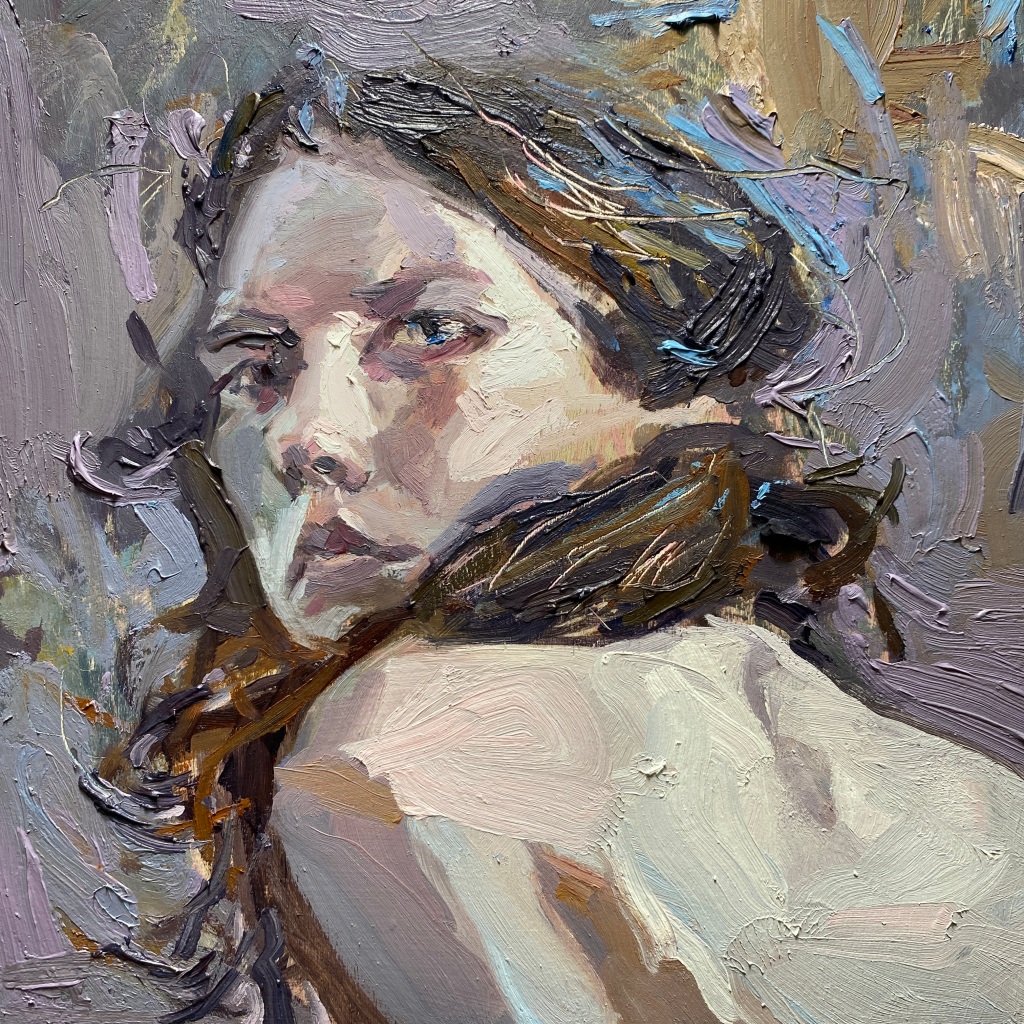
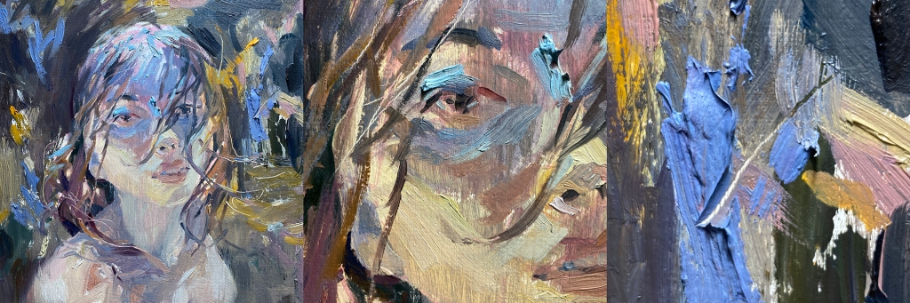
That’s one of the reasons why I picked up the oils a few years ago. I was trying to go at them with a completely open mind – but I think I’m still a sketcher :) We always build on what we know. I love the calligraphic stroke, the use of dark marks as a chunk of structure. I still think in terms of ‘Larger to Smaller, Lighter to Darker’. And using the white paper, which is watercolor thinking.

In the case of these paintings, I’m letting a scrubbed out underpainting show through, much like a wash beneath the ink strokes. But with the oil, I have the added dimension of thickness, and the direction, or movement in the brushwork.
A paint stroke in oil is underlined by the shadows it casts on a smoother passage. Sometimes in watercolor you’ll get a halo or a hard edge that pools around a stroke, due to pigment floating to the edge of the dampness. In the oil, this is an actual cast shadow which moves with the light. Somehow I feel an oil painting is more ‘alive’ because of this.
I know some of you don’t love it when I talk about oils :) I see the comments :) I think it’s a sense that I’m leaving people behind, or that I’ve ‘moved on’ from what you came here for.
But if you look at this oil sketch, it could just as easily be gouache over watercolor. It could be posca markers over glazing in colored pencil. The underlying way of seeing is the same.
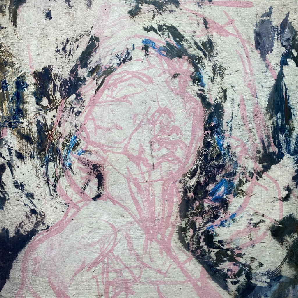
I’ll end this #OneWeek100People marathon with this ‘failed painting’, because it’s the failures that teach us more than the successes :)
I didn’t like the way this one turned out, so I scraped it off. The sooner you scrape off an oil, the easier it is to start again.
If you let it dry, you have to sand off the panel, and at that point it’s almost not worth saving it. I worry about the dust being toxic. Paint pigment is only a hazard if you inhale it, or it’s transported through the skin / lungs via solvent. I don’t paint with solvents anymore, only linseed oil, so they’re perfectly safe to paint with – but sanding down a panel is about the worst thing you can do. Wear a proper filter mask!
Anyhooo – I was surprised to see the the under-drawing remained intact. The same kind of sketch is underneath all of these heads. It exactly like a gesture drawing done in charcoal, or the pencil lines underneath yesterday’s watercolor sketches. This is done in pink gesso (regular gesso, tinted with a few drops of red ink), so A: it dries fast and you can paint over it immediately, and B: I can correct the drawing with white gesso, or even ‘white it out’ and start again.

So! That’s my week! I hope you guys had a great time with your own marathon. I’ve been looking at the Facebook group, (though Facebook is being annoying and only showing me a fraction of the posts). And also seeing some of you tagging me on Instagram, and it’s been a great pleasure to feel like I’m sketching along with you.
Thanks to everyone who participated!
I’ve made a few noises about ways I can change up my own #OneWeek100People. (Such as trying to get 100 every day, and seeing what the impossible challenge does for my mindset.) I did also think of trying to do 100 people entirely from imagination. Crazy as that sounds :) The complete opposite of urban sketching :) I’ve always toyed with the idea of doing a comic book, so that’s a skill I’d love to take on.
If anyone has other ideas for how to expand or enhance the event, please drop me a line. I would like this event to be open to any approach. More ways we can keep learning together.
Take care, and happy sketching!
~m
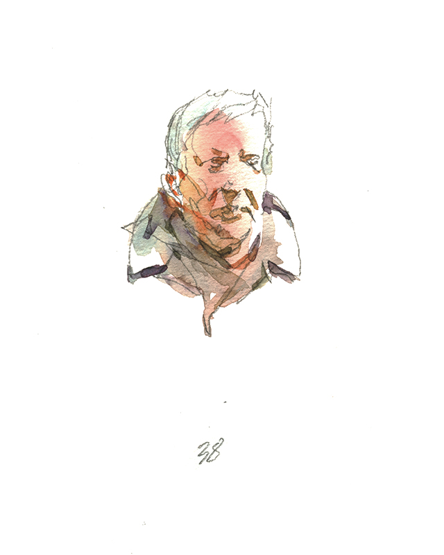
Ok, I did it! Day Four; finished my 50 in watercolor!
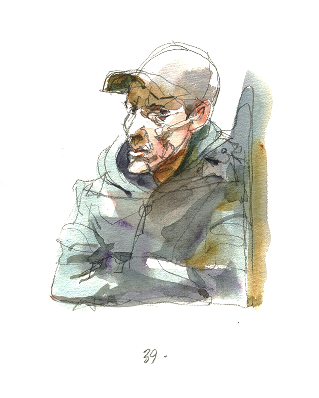
I really wanted to do 100 in color. In fact, I wanted to do 100 every day this year! 500 in a week! – But I’m a long way from achieving that.


It’s kind of an interesting goal. 500 in a week. I haven’t really tried it for real, but I keep thinking about it ;) A genuinely stupid idea, that might actually be amazing if you accomplished it.
You’d really need to be organized. Like – the biggest problem is the wet drawings. If I was using dry media I could just work in a book. But you can’t do that in watercolor – too much waiting to turn the page, to much re-visiting the drawings for darks.
I used to tape each page to it’s own (coroplast) drawing board, but you can only really carry six boards in your average day bag. I have used larger boards. Maybe that’s the trick – bring a set of 16×20″ panels – draw 10-15 figures per sheet. I’ve done this multi-drawing-page thing in life drawing classes for this exact reason. Dealing with the wet sheets when you don’t have a lot of room to work.
But you’d need 6-8 coroplast panels. or perhaps fewer if you taped paper to both sides. A person could carry that all day, especially if you made some kind of sling. But a big board can be impossible on a windy day. It might be much better to do this in summer. March is still too soon in Montreal. I’ve been working small this week, with only a tiny shoulder bag, because I’m in and out of the subway and the cafes. With the big panels you’re stuck working outside, practically speaking.
Or; maybe I could go back to books, and just bring three books. They are making sketchbooks thinner these days so you could cut down on the extra weight. If you alternate, and it’s a sunny day, it might be possible to go from spread to spread and have dry pages by the time you’re back to book one. I know that would work on a hot dry day, especially if there’s a breeze.
See, there’s enough ideas out there to do #OneWeek100People more than once a year :) It sounds like I need to try a midsummer marathon :) Let me know if anyone is interested in doing it more often! Maybe it could be three times a year.
#OneWeek100People 2024 : Day Three : Tried to do 100 watercolors! < and failed! (but that’s ok)

So, if I couldn’t do 100 pen-and-ink people in a single day, what makes me think I can do it in watercolor? I only managed 25 today! The same thing happened to me last year! What’s that saying about doing the same thing over and over expecting different results? :)
It shouldn’t be a surprise that doing a sketch (clear-line in pencil this time) AND painting it – naturally that’s going to take twice as long.
Plus – I have to find a restaurant (or the study carrel’s at the public library are perfect) where I can lay out sets of six or seven sketches and work them all wet at the same time. I do these in waves, getting all the first pass washes, then going back for any dark touches. Then clearing the deck when they’re dry and doing another round. It must look like a kind of crazy game of solitaire.
So; these are all done from cellphone snaps, rather than from life. It seems like the only way to get a huge number of sketches in a day. Besides, if I go to a nice café, I can have a slice of pie while sketching :)
I don’t know what I was thinking with this people thing! I should have been sketching my desserts. Maybe this summer I’ll do a 100-pastry tour of Montreal. That sounds like a lot more fun :)


[ Click anywhere in the gallery to start a slideshow ]
Back in the day, (I’m sure this was N.C. Wyeth, so that’s 1940’s), he used to have costumed actors come into the drawing class. They would strike some poses or do a little skit – then leave the room. Students would have to paint the models *from memory*.
So, my point is, once you understand the planes of the head, and the way clothes drape, you don’t really need to be staring at someone to draw them. I’m quite sure I could just sit watching people, maybe make some squiggly five second doodles, then just draw them from my ‘notes’ when I get home. Remind me to try that sometime and post the results!

These days when I use a cellphone picture, I don’t even try for a good picture. It’s basically impossible when you’re trying to take stealthy shots. I actually don’t like taking pictures of strangers. It feels like bad behavior – though I don’t really think it is. It’s actually less intrusive than drawing them live! But it seems more weird to be doing it.
I don’t know if that’s just me. What do you guys think? Is it rude to take people’s pictures? I think in Europe it would be considered more rude. People here are willing to let it slide. I’ve had one guy shake his head at me, but that’s one out of hundreds.
Tons of artists do subway sketches; do we all hide what we’re doing?
One thing about drawing live – if you get caught, you can just show people the drawings and they usually enjoy it when they see it. If you’re just collecting people on your phone, it’s much harder to explain what you’re up to.

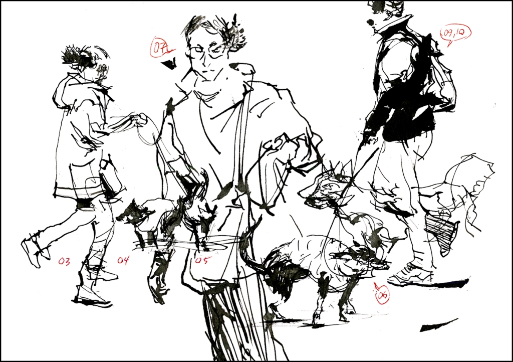
Here’s a story: I was finishing off my day at Fameux, a notorious Montreal landmark (a 24 hour greasy spoon with – honestly – terrible food :) but somehow there’s an allure to a place like that. I had a poutine, because, why not, it’s traditional in a place like this. And I like their completely fake lemon meringue pie. The kind that is basically Jell-O with a mountain of whipped cream topping.
Anyway! – I’m finishing up these dog walker sketches, and the waiter approaches me, asks if I can draw his puppy that recently passed away. So I took his phone and did a quick sketch for him. He seemed really moved, and offered to get my dessert but I said that was ok, no worries.
You really can’t get that kind of heart warming interaction by taking photos, can you now? Sorry to all the street photographers out there. I know that’s a whole art form, and they’re always seeking credibility for what they do. But it’s just not a charming interaction. Photography has that aspect of ‘stealing your soul’. It seems somehow like a ‘taking’ activity. But when people see you drawing, it’s really like magic for them. In this case, it was absolutely a ‘giving’ opportunity.
So; that’s my conclusion. I do this snapshot thing for the marathon, but I really wouldn’t do it ‘in real life’. so – maybe next year I won’t! This will be the last year of these kind of fun-but-fussy sketches! That’s my commitment!
#OneWeek100People 2024 : Day Two : Getting my 100!

–
So yesterday I did too much walking around and not enough drawing. Good exercise, and it was a sunny afternoon so I didn’t mind, but I didn’t get my 100! – and then the next day; winter is back! So that sucks.

–
Here in Quebec we have a convenience store called ‘Couche-Tard’, meaning, Go-to-Bed-Late. Back home they’re called ’40 Winks’, but I’m not sure if there’s many of them still standing in Alberta.
Here we call it a dépanneur, or just ‘the dep’ (which can also means handyman or helper, so that’s the word for ‘convenience store’ : )

–
Couche-Tard is famous for their fake Slurpee which is called a Sloche. The interent says “The Sloche has gathered much publicity through an aggressive (and sometimes controversial) marketing campaign.” < [That’s just a list of the obnoxiously funny drink names ]
This is all just a long winded way to say, it really sucks when it rains and snows at the same time. You end up with this whipped-meringue of ice water that weighs about 10lbs per snow shovel. I had to do that two days in a row this week.

–
Anyway – I’m just chatting at you today while we look at sketches :) :)
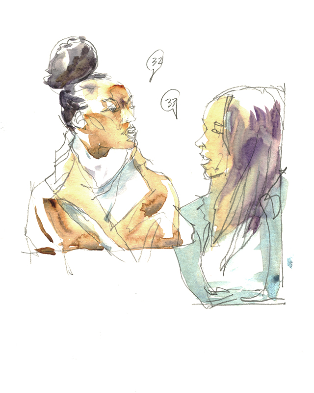
Sometimes everyone is just ‘normal’ – so I look for conversational groupings. People often walk in pairs and you can sketch the way they’re interacting with each other.
That guy in the hoodie was very suspicious what I was up to. These are from cellphone photos and then drawn in the café. Is that ‘cheating’? Depends! If your goal is to develop your reportage style (that is, the ability to draw on the spot, in the action, under pressure, without fail) then yes, you’re cheating yourself of the discipline if you take pictures. Drawing purely live, in the moment, takes a lot more practice. And a lot more acceptance of your own mistakes. But how often do you really need this skill? If you want to be a reporter or a courtroom artist – sure! Or if you’re really serious about your journaling :)
But if your goal is to practice proportions, or draw drapery (clothing and bags are fun!) or learn how to make sketched portraits with personality – then all that is fair game from phone-shots.
Let’s just say : both skills – live drawing and sketching from reference (or the posed model in class) – they both contribute to each other. It’s cross-training. You need to do a bit of both.


#OneWeek100People 2024 : Day One : How to draw 100 People in a Day (even though I didn’t make it this year :)

It’s (almost) spring in Montreal, and the city is coming back to life – or – that’s just me I suppose. There’s plenty of people who enjoy winter, but I’m not one of them!

In the dark months, I go into hibernation. When March finally rolls around, it’s time for #OneWeek100People – it’s become a pagan ritual for me. A wild celebration of street drawing :) All work stops, I skip the gym, drop the home-reno projects, and I can eat anything I want when I’m out sketching!

For the last few years, I’ve been somewhat pulling back on Urban Sketching (as you are no doubt aware – you’re probably one of the dedicated subscribers who’s stuck with me :) This week is the first drawing I’ve done in months. Thus, I always start with the basics. Some years I do ballpoint, sometimes just a brushpen – the most basic kit possible. This year, I went with three tools. I always say, you only need two – the thinnest line, and the thickest line (which is usually a brush for me.) Today I have a crowquill nib, and my trusty steel brush, though I also brought a worn out sable so I could do a little drybrush. Since we don’t have color, at least we can have a little texture.

I wanted to do my show-off thing and do all 100 on the first day, but somehow, I couldn’t manage it. I’m going a little slow this year. Maybe I’m getting out of shape, maybe it’s because I have a little dental trouble right now. (Have to have a tooth pulled – they want $6K for an implant! That could be a sketching trip anywhere in the world!) but MORE LIKELY, the problem is I’ve become too picky.
When I look back at the first year, I see I was much more relaxed about the drawing. Less concerned with finding the right person. I would just draw anyone who passed in front of me. Doing 100 drawings in one day demands that you are sketching constantly, with as little downtime as possible. They’re just gesture drawings, but it’s still a lot of work. When I did it last year, I stayed out for 12 hours. This year I was lazy and knocked off at eight, AND, I didn’t even start till afternoon (it was too cold in the AM).


So here’s some tips for doing all 100 in a single day, even if I *failed to do it this year*!
How to draw 100 people in a single day:
- Use only one tool. Just a ballpoint, or just a brushpen: So you stay in the same ‘mark making language’ the entire time. Work direct-to-ink (or color). No pencil and drawing over.
- Stay in one place, draw whoever passes by: Don’t spend a lot of time looking for ‘interesting shots’ (my mistake this year!) – make each person interesting by how you draw them! Pick a populated place; such as my 2017 marathon where I went to a sold out show at the museum of fine arts.
- Draw small: I use a small pad, maybe 6×9″ and I tear out all the pages in advance so it’s just loose sheets. Then I can tear up a bad drawing, or just flip it over – whatever it takes to keep drawing. (These images are multi-page collages.)
- Pace Yourself, and; “Quantity is Quality”: The marathon is the goal today, not the individual drawings. I number my sketches as I go to pace myself – maybe I have to pump up the numbers with a messy crowd scene (or a page of tiny figures. If you really want to ‘win’ – go for the doodles!) I should actually count DOWN from 100 – that would be more motivating. I’m doing that next year!
- It’s a marathon – carry snacks: Just like a runner – chocolate is a good idea when you need to bribe yourself to stay put and keep drawing.
- Keep your mind in the game: I listen to podcasts or talking books. Sketching is reflexive for me; it’s eye-to-hand with no brain in between, so I like to keep my mind occupied. Conversation with a sketching buddy works too, but it’s hard to find someone that’s up for 8-10 hours of drawing and a lot of random walking.
- Remember your goal: You’re getting better with every drawing; even if it’s a failed drawing; even if it’s a boring drawing; you are getting better.


This year I bought myself a 5 Day metro pass so I can travel around from station to station and pop up on the street. I don’t want to be feeling stupid for paying for only one stop, or backtracking on my route.
One downside of subway sketching is you’re getting a lot of ‘people on the phone’ sketches. I used to feel this was a mistake, that it’s a boring pose – but I realize now it doesn’t matter. If you consider the subject to be more important than the drawing itself (I don’t know, a fire-eater or an exotic dancer, both things I’ve gone out of my way to sketch), then you’re on a treadmill chasing experiences. This can lead to a lot of fun adventures (one time we went out to draw rock climbers). But that’s not sustainable. Eventually you’ll be investing more time and energy in the travel than in the drawing. (Not to mention it gets expensive).
Maybe that’s grumpy old man talk. You should absolutely draw strippers when you’re young and dumb. You probably won’t feel up to it when you’re older :)


#OneWeek100People 2024, March 11-15!
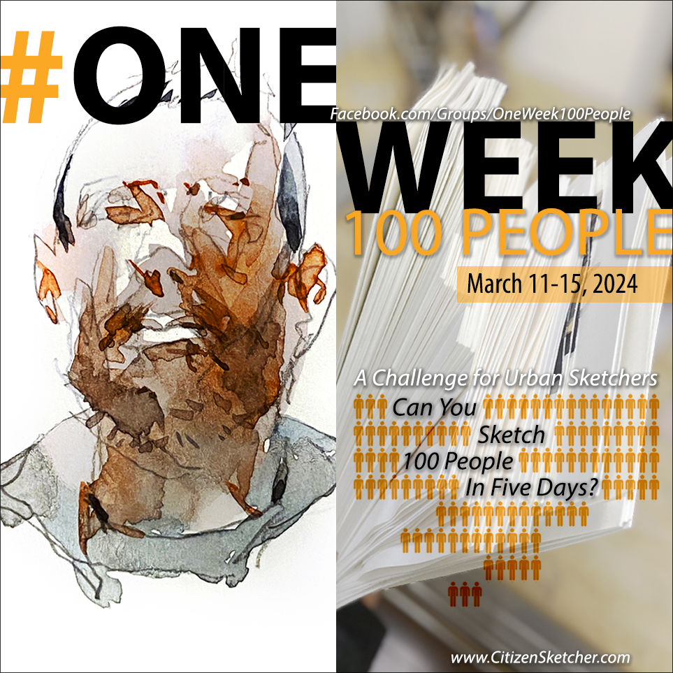
It’s almost spring, the weather is turning. Slowly, slowly there’s more light each day. This time of year I’m starting to anticipate our annual sketching challenge #OneWeek100People.
When March rolls around in Montreal, the street-sketching season is still on the edge. Some years it’s honestly still too cold – but I always have the museums and the subway for sketching days. I have a touch of seasonal-affective disorder. It runs in my family. I’m not as bad as some people, but it’s enough that I’m really counting the days till you can go out without boots and a coat, and get a whole day of sunlight. It’s a whole new lease on life for people who live up north!
I hope wherever you are, maybe you’ll catch the spring-sketching bug, and head out to do some street-sketching with us.
Of course, this isn’t an official UrbanSketchers.org event, so we have more generous rules. Sketching from video, photos, or posed life drawing is ok with us.
I hope you’ll find some friends near you and join us for the eighth year of #OneWeek100People. Let us know if you plan to participate, especially if you’re looking for sketching-buddies near you, and please feel free to send me sketches during the event – either here on the blog, or join our Facebook Group.
See you soon!
~marc
Notes from a Workshop!
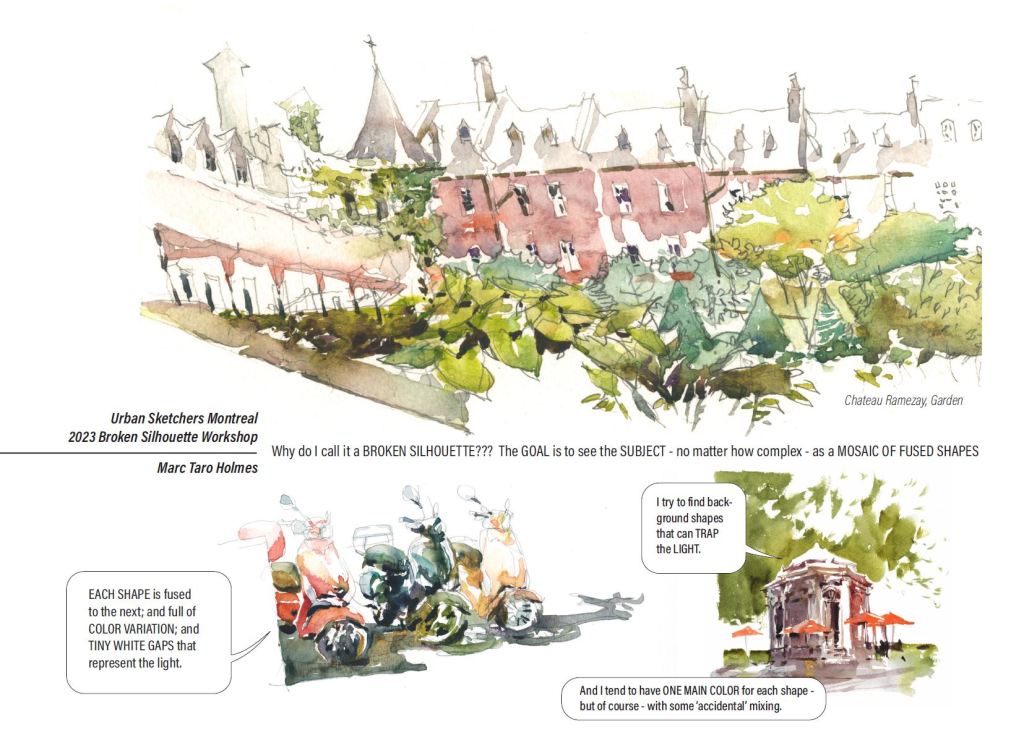
Hey everyone! Here’s a little free handout I made for the first ever USK:MTL instructed workshop! Held this past weekend in the Old Port of Montreal. The local team put on a great event, with three instructors, in a excellent location offering drawing subjects only a few steps away!
If you’re ever in town and looking for a cute place to sketch, I recommend the little park called Place d’Youville. It has one of the loveliest buildings in town: the Caserne Central de Pompiers. Built on the archeological site of the first Parliament of Canada. There is a very well done museum exhibition and interpretive installation on site. All of the blocks right around here feature quaint views that take you back to an earlier time. It is also the site of a little festival: the 18th Century Market, which is produced every year by the Pointe-à-Callière – our local archeology museum.
Thanks everyone who came to sketch for the day!
~m
Someone had asked me about how to paint interesting backgrounds for these floral sketches – so! I thought I’d do a slightly longer video (10 min) showing a rose painting from beginning to end.
This sketch emphasizes Negative Painting and Broken Silhouettes, and shows the way I fuse shapes by laying rich strokes of color side by side <<< and the importance of working briskly enough. You have to keep the wet edge moving forward, until you close the shape you’re working on. Ideally, all your strokes will merge on the paper, and you won’t get any dry edges inside a shape.
I titled this video A Shape By Any Other Name – because – it’s not actually video on painting roses, so much as a demonstration that anything can be painted with colored silhouettes :)
These happen to be flowers, but every subject can be painted the same way.
Thanks for watching!
~m

Day 21: #30x30DirectWatercolor : The Blue(ish) Boy
Something different for Day 21!
For day 21, I have an experimental video for you. I’ve done a full-length recording of a sketch, I believe it’s 23 minutes long. Significantly longer than the little slices I’ve been putting up for you so far. Unfortunately, it also took two days longer than I hoped to get this finished.
This is a portrait sketch of Zack Pinsent of @Pinsnt_Tailoring on IG, and it’s a vertical video, so you may want to watch it on your phone or tablet (very likely you are), for the best vertical experience :)
I’m very interested to know if you enjoy this video? Is it interesting to see the entire thing, beginning-to-end – or do you prefer the shorter clips I’ve been doing so far?
Have a watch; if you have a coffee break to spend on it! And please let me know what you think.
Thanks,
~m
PS: The post title is a play on the Gainsborough painting The Blue Boy. Kudos to everyone who guessed that already :)