Incident at Lady Meredith House – Workshops on my mind
The last couple days I’ve been out painting Lady Meredith House, at the corner of Pins and Peel, in the heart of the Golden Mile.It’s well situated on a steep corner and has a fantastic roof line, studded with witches hats, tall slender chimneys and decorative brick work.

I pass this house frequently, and have always wanted to paint it, in fact, this is actually my third sketch at this location.
By that I mean, I just did three days in a row in the same spot.
Why? A little bit crazy I guess. I’m having some sort of perfectionist fit this week. Normally I’m quite free about sketching – whatever I get is fine. Some turn out, some don’t. It’s all part of the process.
But these days I’m feeling I have to up my game, as I’ll be painting live at the Urban Sketchers workshop in Santo Domingo this July, and at my own 3 day sketching event in Portland this August, (in partnership with fellow Montrealer Shari Blaukopf).

Normally I might have been happy with my first sketch. But this time, I couldn’t live with it. There are numerous flaws. First among them is dead, monochromatic color.
I used a single color (Burnt Sienna for the brick, and Payne’s Grey for the roof – and pretty much just layered them darker and darker each pass.
Yes, this is a dark building, so it doesn’t take reflected color the way a light colored structure will. But, still no excuse for drab earthy tints. My take away from the first failure was: use stronger colors and let them mix on the page! Never just add grey to make shadows – use a complimentary color to make a complex dark mix. And whatever you do – don’t be boring! Unified shadow shapes does not have to mean monochromatic passages.
Second major problem – the house is just plonked there, like it’s in the middle of a farmer’s field. I like a strong focus of interest, but simply leaving out the environment doesn’t work. The house just sits there like a lump.
It’s too big on the page, there’s no sense of space. It’s such a static, dull, leaden composition. It’s almost not a composition at all. I’m not too happy with all the fiddly (also monochromatic) bits of foliage either. It looks like a bed of lettuce under that turkey.

This is my second attempt. I addressed the boring composition – climbing up behind the wall of the Irving Ludmer Research facility (which I painted last year). This gives me an interesting design element in the foreground.
I did a better job planning the surrounding trees, and included a bit of environment (the lamp post, the house behind). Unfortunately however, I was so excited about this foreground I ended up jamming the house up against the top of the page.
As well, the bricks are still too monochromatic. It’s better, but still just variations of Burnt Sienna. I realize now this is the first time I’ve painted bricks – so this might be a natural learning curve :)
I could have said, okay,okay, I’m getting somewhere, onto the next thing. But – what can I say. The good weather lasted, so there I was on day three, doing it again.

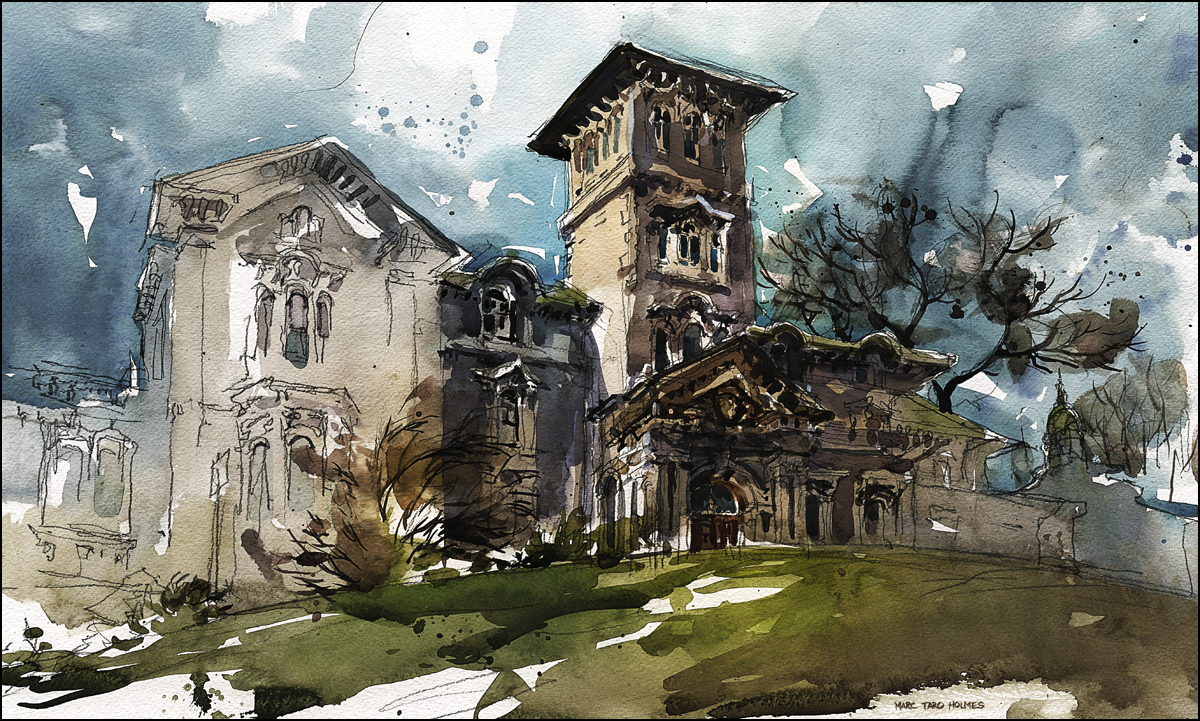
In my third (success at last!) version I have the more dynamic composition, the more lively color – and I addressed two other things that were bugging me. More attention to the rule “Contrast of Shape” inside my brushstrokes – so there are some big sweeping marks in the trees and sky to contrast with the small details in the house – avoiding a tendency to make a lot of similar shaped strokes, and helping to focus the eye toward the detail at the center of interest.
I also realized I wanted to think about each plane of the house as having a different color and temperature. To break up those damnable bricks into shapes (planes), and better describe the complex structure. Every time a surface changes direction, it should change color and temperature.
It’s also interesting that the version I like the best is the least accurate drawing. What can I say? I find this an elegant fanciful building, so when I finally let go and drew it expressively (in this case, elongated and with pushed perspective) it really started to speak to me.
Sorry for the long post, I hope it’s helpful to some. I’ll leave you with a classic Fisherman’s Trophy Shot – the “yes, I really painted this on location”.


I think all three examples are really splendid work and take me back more than half a century to the Victorian buildings of Manchester (UK) where I was raised. Here in France I also enjoy three days on the run with the same outdoor subject – especially when the weather changes – but too often find the last result not as good as the first (maybe I need to get out more!). However, when I read your final comment… “the version I like the best is the least accurate drawing” it reminded me of the beauty of interpretive recording through painting and sketching rather than the universally popular photography which just comes out as it is.
Thank you for very interesting post, really enjoyed your paintings and especially explanation. I love all version, but the most one in the middle. Something very appealing in its a bit reserved colors, very classy, I like texture and splashes on green. And the one on the bottom is special with this unfinished white structure, it draws you in and leave longing, almost nostalgic. Love it. Thank you.
Thank you Marc for the colour explanation and the 3-5 principle… huh! I have still alot to learn, which is quite neat actually as there is hope that I can improve ;-) The trouble that I usually have is in “choosing” the colours, so your info is very helpful.
House #1 feels like the house is living for you, with its quirks and long towers. House #3 feels like a heavy mortgage, that one lives for that house. So my choice is house #1, even though all of them are totally gorgeous and sublime!
Great post. Thank you for going into detail about your analysis of what works and doesn’t in each version, and how you made decisions to refine or change things — that’s what I really like in art blogs. I admire your determination to see this one through three versions!
This is really a great post. Thanks for taking the time and trouble. I love your art.
you sure don’t pick the easy ones! I signed up for your workshop here in Portland for August. Looking forward to picking up tips from you and Shari.
I’m also going to be in Montreal in late Sept for 3 days before wife and I board a cruise ship. I’ll be asking you about places to go and see and sketch…
Hey Mike – good to meet you :) For sure, I can point you at some good stuff in Montreal – or even meet up for some sketching when you’re here :) The highlights are definitely Old Town Montreal – Place Des Arms square is a good place to start, then going down to the quai. But also the area called the Golden Mile just up-hill from downtown overlooking the McGill campus. That whole area is full of interesting houses and some big hospitals and heritage buildings. If you’re into a nature walk, there’s a trail going over the mountain that has some views and maybe even a touch of fall color beginning in Sept. See you in Portland!
Thanks for the long post! It’s good to know the thoughts behind your artistic decisions. I took some mental notes about: using a complimentary color for darker areas & shape contrast.
[These last few weeks I’ve been reading your blog from the earliest post so I can learn as much as possible from your work and maybe get some insights behind them. I took your online courses on Craftsy last year and I love it. I have learned so much, especially about how to sketch loose, something that I’ve been striving to master until today.]
Anyways, among these 3 paintings, my favorite is the second one 😁
Great to hear you’re going all the way back! It’s a trip :)